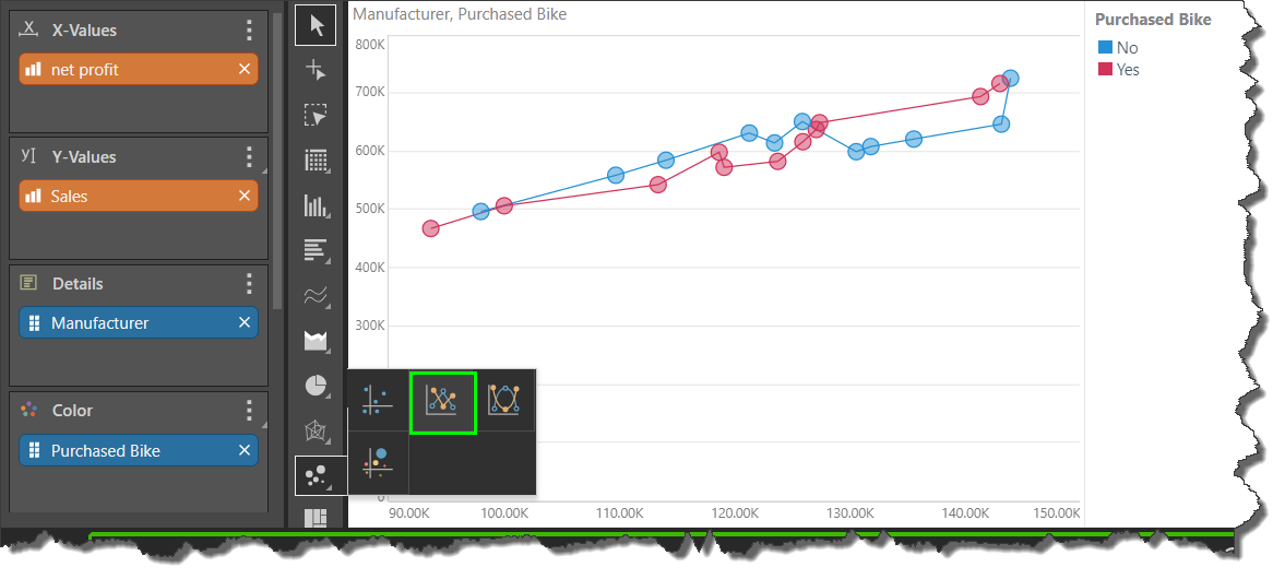
The scatter line chart is scatter chart that joins the data points of each series by a straight or curved line.
Like the scatter chart, the scatter line chart requires a measure in the X-Values drop zone, a second measure in the Y-Values zone, and a member hierarchy in the Color zone. You can add another hierarchy to the Details zone.
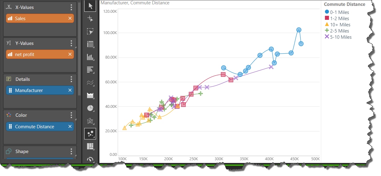
Scatter Smooth Line Chart
The scatter smooth line chart connects the data points by a curved line rather than a straight one:
Example
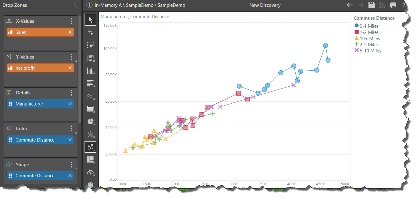
In this example, the chart shows sales and net profit for commute distance by manufacturer. Commute distance was also added to the Shape drop zone to more easily differentiate the commute distances in the visual. This also produces a combined color shape legend.